Analytics overview
Introduction to using Leanplum Analytics
The Analytics dashboard in Leanplum shows usage data and results for all of your A/B tests, messages, and Lifecycle Campaigns.
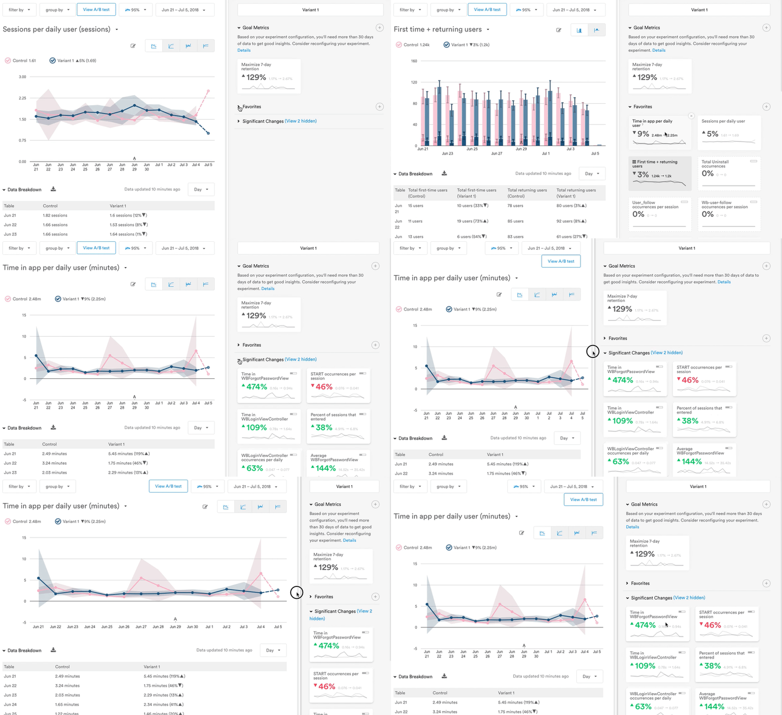
The Analytics dashboard is responsive to your device screen. On a laptop or monitor screen larger than 1600px, the metric tiles appear to the right of the graph (as shown below). On a smaller screen, they appear beneath the graph; scroll down to see them.
Analytics tools labeled and defined
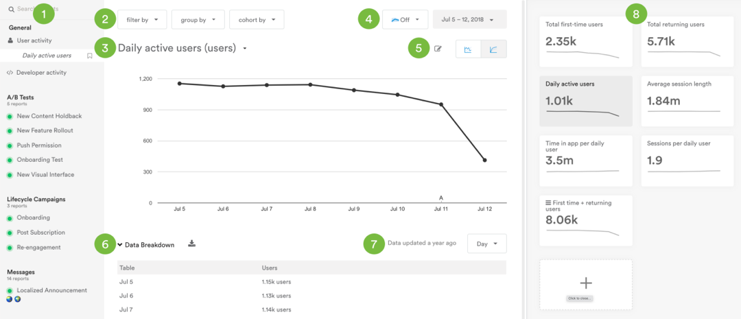
- Sidebar. Displays all available reports grouped into four categories: "General," "A/B Tests," "Lifecycle Campaigns," and "Messages."
- Filter, Group, and Cohort. Dropdown controls for adding a filter, group, or cohort to your report.
- Metric Selector. A dropdown of metrics to specify the chart's displayed data.
- Confidence interval and Date range. Controls to set the confidence interval (for A/B test analytics), and date range for the report.
- Graph options. Includes controls for chart annotations and viewing actual and cumulative data.
- Data breakdown. Expand option to view data in a table by interval, and download options to export to CSV.
- Interval selector. Options for how to display your data (by hour, day, or week).
- Metric tiles. A group of sortable tiles surfacing relevant and favorited metrics, goals, and significant changes.
Reports
All of your A/B tests, messages, and Lifecycle Campaigns are listed in the sidebar, allowing you to quickly switch between reports. See our Reports overview for more info.
Bookmark a report
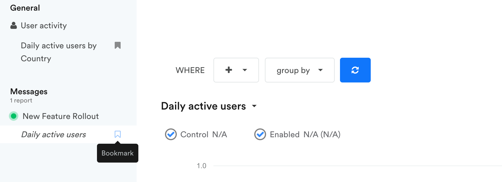
When you create a new report from the metric selector or metric tiles, that report will appear in the sidebar. You can bookmark it for future use by clicking the bookmark icon so the outline fills in gray. Remember, if you switch to a new report before bookmarking a custom one, you will lose any filters, groups, or cohorts you applied.
Metric tiles
The metric tiles surface important data so you can see the impact of your campaigns at a glance.
Click a metric tile to see that metric represented in the graph, see a breakdown of data, and download the report. Then you can bookmark the report in the sidebar for future reference.
Expand and collapse tile categories by clicking on the category name, or by clicking the ellipses tile to view more Significant Changes.
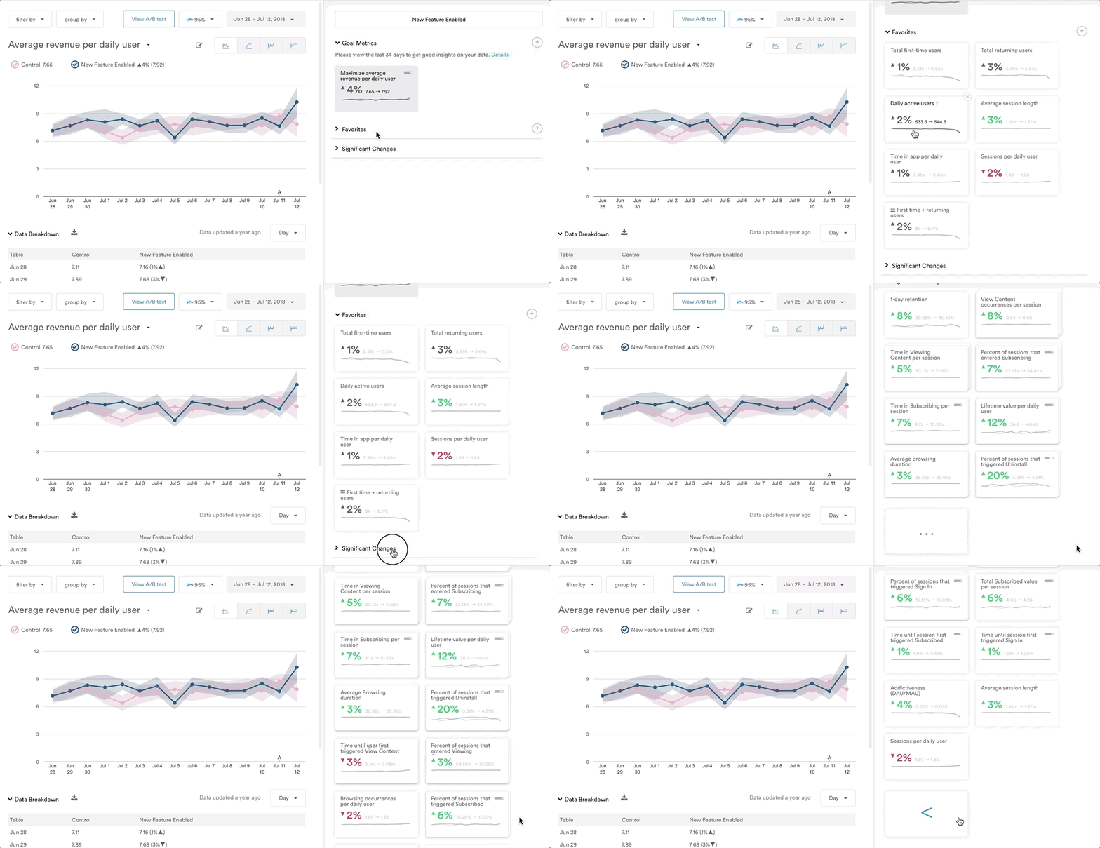
Color coding. A green or a red metric tile indicates that the metric has experienced statistically significant change based on your campaign. Green indicates a positive change in the metric, while red indicates a negative change.
Signal strength indicators. The signal strength of a metric represents the portion of your audience that a metric reaches. Signal strength appears as a small grey bar in the upper right corner of a metric tile. This is designed to put metrics into perspective. For example, even if a metric has a very drastic change in terms of statistical significance, you may decide that it's not as important as other metrics if it only affects a very small portion of your audience.

Add or delete a metric tile
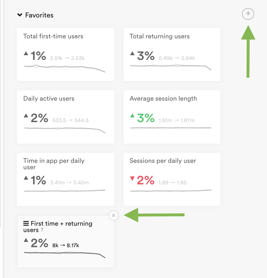
To add a new metric tile to your Goals or Favorites, click the + icon in the top right corner of the metric category. Then make a selection from the "Choose a Metric" window.
To delete a Goal or Favorite metric tile, hover over the metric tile and click the X icon. Then click "Remove" in the popup window to confirm the deletion.
Updated about 3 years ago
